United Airlines
Course
Brand Identity 2
Categories
Brand Identity, Visual System
United Airlines is a major carrier in the United States; however, during the September 11 attacks, two of the four airplanes hijacked were United aircraft, which resulted in an industry. Then, Continental Airlines merged with United and used Continental’s logo and livery. In 2017, a seating problem on a United Airlines flight ended with a man being dragged from his seat and had provoked an outcry on social media. That incident made United Airlines become the world’s most hated airline and spread a bad image widely.
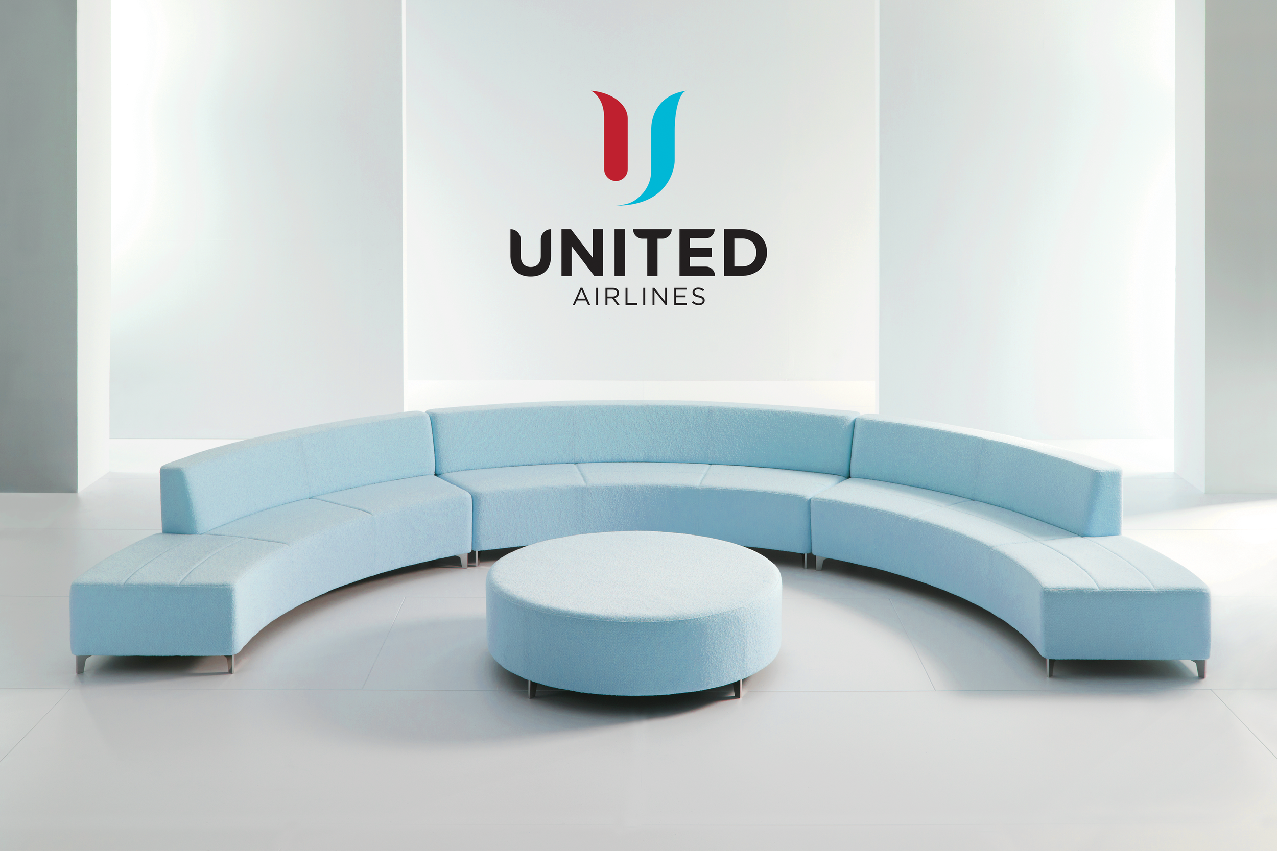
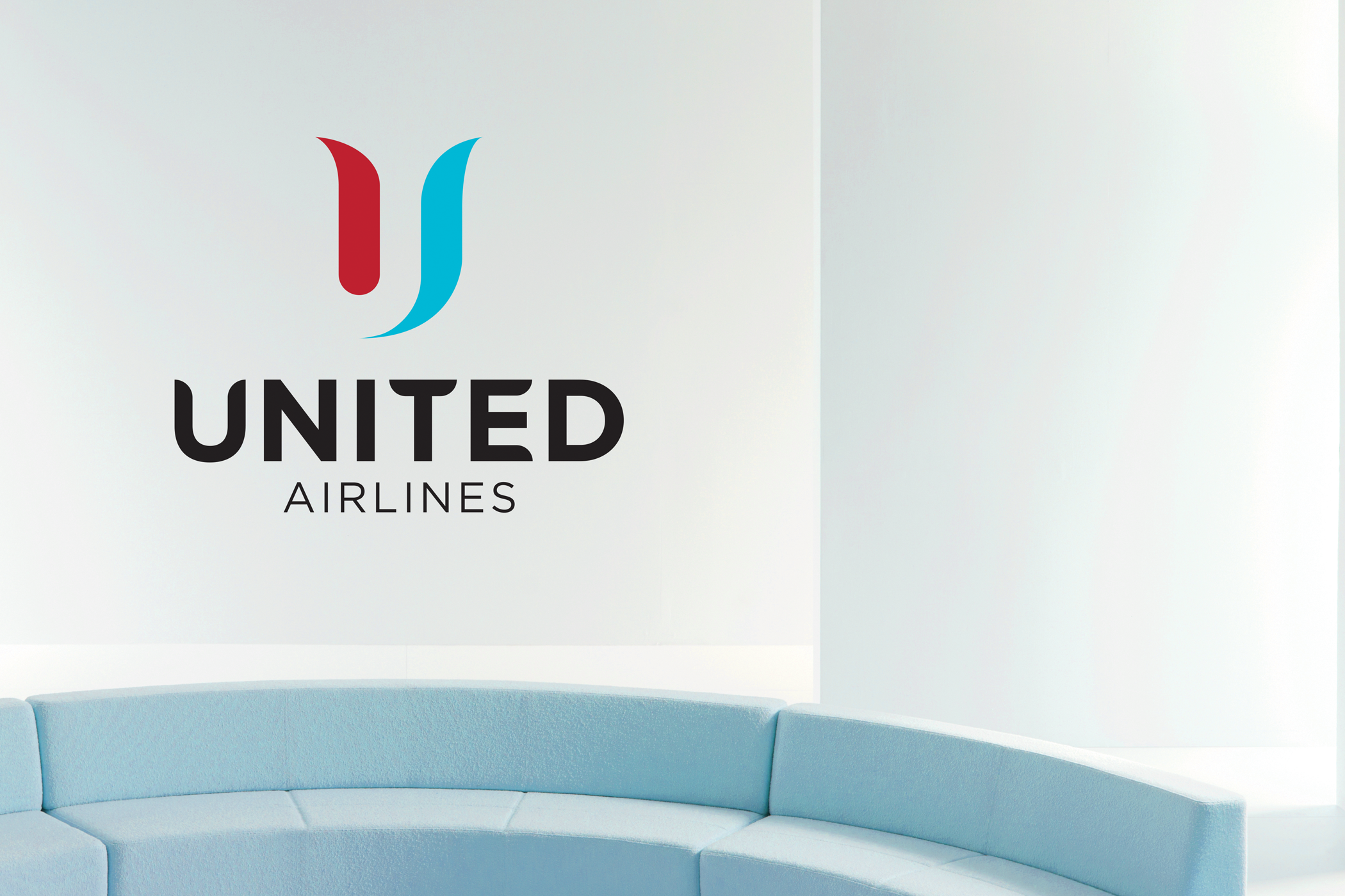
To help United Airlines move on independently and be able to stand on its’ own again in the international market, rebranding is necessary to reshape business trademark and rebuild brand reputation. The new logo was inspired by the pre-merger United logo, commonly nicknamed the “tulip,” showing a unique letter U reversed out of the flower shape. The color palette consisted of red and blue to proudly represent the United States; especially, the blue was brightened up to indicate a clear sky, a better future, and a promising customer service.
The “tulip” logo—a red, white and blue abstract of the letter U—survived three branding changes for 38 years since it was first introduced in 1974, replacing the “vertical spike” logo which preceded it. The “tulip”—originally designed by Saul Bass—was updated in 2004 by Pentagram in a monochromatic blue scheme as part of a refreshing of the livery of United Airlines.